Tuesday, July 21, 2015

Sala Ayutthaya by Onion

  • Architects: Onion
  • Location: Phra Nakhon Si Ayutthaya, Phra Nakhon Si Ayutthaya District, Phra Nakhon Si Ayutthaya, Thailand
  • Architects In Charge: Siriyot Chaiamnuay & Arisara Chaktranon
  • Area: 3500.0 sqm
  • Project Year: 2014
  • Photographs: Wison Tungthunya
Sala Ayutthaya is the twenty-six-room boutique hotel, right across a most picturesque site of the old capital of Thailand along the Chao Phraya River. The main entry of Sala is next to a Sala Tree on U-thong Road. It is a single iron door on a long brick facade, leading us to the low wooden ceiling reception and the double volume art gallery. Within this space, the dominant feature is an antique wooden door that Onion designs the framing for. It is placed between the transparent mirrors, opening to the exterior courtyard, narrowed by the paralleled brick walls of multi-curved geometries. They frame the image of the sky.


What is unique about this main circulation is the constantly changing shadows. The curved shadows from the two sides normally meet on the floor at about eleven o’ clock in the morning. They transform the atmosphere of the space at different times of the day.

Sala layout is a compound of twelve private residences, proportionately packed within the limited area of L-shape land, leaving the focal points of the project to be the outdoor spaces. They exhibit the local craftsmanship of brickworks, juxtaposed with the simplicity and neatness of the white walls and a solution to the problem of annual flooding, inspired by Chand Baori Step Well in Rajasthan, India.

At Sala Ayutthaya, the step decks are designed to be flooded. They lead us down from the one-storey high platform to the same level as the river. Four red-flower trees called jik are planted next to the main deck in order to signify the location of the outdoor bar. Along the narrowed river bank, Onion plants a row of tropical tree named krading-nangfa (its literal translation is the ‘angel’s bell’ tree). Their bell-shape flowers will eventually blossom. Their branches will suspend themselves down towards the river and form a long tunnel of fragrant tree. Sala Ayutthaya will be more complete with age.


The privacy of Sala guests is secured through the circulation designs. The architects decide to use a single load corridor much less than a series of staircase that directly lead the clients to their own bedrooms. Each bedroom is always different from the other. There are at least three rooms that have the direct access to the step swimming pool made of white marbles. The most cozy one is a smaller bedroom that has its own private terrace and a hidden daybed for children. A more spacious room does not have the river view, but its longitudinal wall is facing the longitudinal side of the swimming pool. On the upper floor, the room above the gallery has the bird-eye-view of the brick walls courtyard. The bridge room has the bird-eye-view of the swimming pool and the garden courtyard. These special characters of each room make it exciting for the guests to revisit Sala.


Resources: archdaily

Wednesday, June 3, 2015

Sandibe Okavango Safari Lodge by Nicholas Plewman Architects

Architects: Nicholas Plewman Architects
Location: Okavango Delta, Botswana
Year: 2014
Photographs: Dook


From the architect. A 24 bed luxury boutique hotel in the heart of the Okavango Delta, Botswana. The Okavango Delta is considered one of the seven natural wonders of the African continent. Since the original lodge was built seventeen years ago, it has been declared a world heritage site and in consequence a raft of wholly appropriate, but formidable restrictions have been imposed on building there.


The design of Sandibe not only meets these challenges but is invigorated and inspired by them. It is habitation made manifest of all the creatures that have ever found or made shelter in and beneath the site’s ancient trees. The lodge draws its inspiration from animals that carry their shelter with them or weave it from the organic materials to hand. We chose the pangolin – Africa’s armadillo –as a specific motif because of its shy, elusive and completely harmless nature and its ability to curl into its own protective carapace of scales. The final building appears to have grown organically from its riparian site or, metaphorically speaking, to be some endemic, gentle and maternal creature leading her off spring through the swamp forest.


The completed project meets or exceeds all of the above imperatives:
Sandibe is built almost entirely of wood. Laminated pine beams give curvilinear shape. The building skin is formed like an inverted boat from layers of butt jointed pine scale planks; waterproofed with an acrylic membrane and covered in Canadian cedar shingles. There is no glass other than in the retail shop and library, the “glazing” such as it is, is Serge Ferrari Soltis fabric – a permeable but highly weather resistant and thermally efficient membrane.


All water and soil waste is collected and pumped through an accredited biological treatment plant that renders effluent certifiably safe for discharge into the highly sensitive environment. Finally, the environmental success of the project is perhaps best judged from the fact that the area’s prolific wildlife including big animals like elephant, hippo , lion and leopard have continued to live on and use the site with such disregard for the emerging and completed buildings that you might imagine they simply don’t see it at all. As IM Pei said: “ Good architecture lets nature in.”
Resources: archdaily

Thursday, May 28, 2015

Bridge Pavilion by alarciaferrer arquitectos

Architects: alarciaferrer arquitectos
Location: Valle de Calamuchita, Cordoba, Argentina
Project Architects: Joaquin Alarcia , Federico Ferrer Deheza
Project Area: 85.0 m2
Project Year: 2014
Photographs: Lucas Carranza


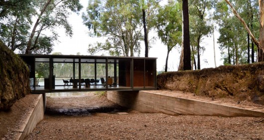
From the architect. Located in a forest on the banks of Lake Los Molinos, this multipurpose space responds to the need for a meeting place for a new housing development of second homes.

The project is located on a channel space formed by the imprint of an old route through the valley of Calamuchita, communicating the city of Córdoba with the south of the province.

The place is highly suggestive thanks to its topographic characteristics as well as by the atmosphere of gloom generated by the eucalyptus forest. The strategy is to respect the channel circulation space but also to experience it in the most intense way possible.


Resource : www.archdaily.com

Thursday, May 21, 2015

Brick House by Clare Cousins Architects

Architects: Clare Cousins Architects
Area: 303 sqm
Year: 2011

Photographs: Shannon McGrath

From the architect. The Brick House is this architect’s own house, which inherently allowed a loosening of constraints and ability to test ideas about living, a core component of the practice’s work. It also permitted unique collaborations with the builder, Cousins’ husband, and the landscape architect, her uncle Rick Eckersley.


The aim was to retain the original Edwardian façade (typical of the streetscape), to remove a small 1980’s extension, and extend to create a single-storey family home. A separate garage with studio above, at the rear of the site, was also designed, its double-storey height reflecting the change in density at this end of the 9m wide site, where it is surrounded by units and flats.


As the main view from the future house, this studio was conceived as an Aalto–inspired sculptural object to avoid the typical ‘box on top’ look, and also solve the problems of western orientation and overlooking. This solution also encouraged the outdoor space to wrap around the home’s living spaces.
The extension to the main house is pulled back from the northern boundary to provide plenty of natural light and afford garden views. This gesture is expressed through a dramatic, curved glazed wall, which forms a dialogue with the sculptural timber-battened screen of the studio.


Resources : archdaily

Wednesday, May 13, 2015

Fine Arts Museum of Asturias by Francisco Mangado

Architects: Francisco Mangado
Location: Calle Santa ANA, 1, 33003 Oviedo, Asturias, Spain
Work Direction: Francisco Mangado
Area: 11142.0 sqm
Year: 2014
Photographs: Pedro Pegenaute


From the architect. The project addresses the whole complex, including the future of the Velarde Palace and the Casa Oviedo-Portal. Only through such a comprehensive approach can the optimal functioning of an institution as important as the Fine Arts Museum of Asturias be guaranteed.


With this idea as starting point, the project contemplates raising an altogether new building within the urban complex. That is, the sequence of existing facades around is taken as a contextual condition, and these facades take on the role of an urban ‘backdrop’, unquestioned, against which to erect a new building with a facade of its own; a facade that reveals itself, is discerned, through naked, totally frameless openings. In the exterior it will be possible to complete a large luminous construction, glazed and full of reflections, that will project outward and superpose itself on urban history, giving the new Fine Arts Museum of Asturias a bold but complex image.


The other fundamental element for explaining the building’s relationships with the context is the inner block courtyard. Through luminous glazed catwalks, the courtyard becomes a place for encounters and an element connecting the various buildings of 
the museum complex.


Light is always important in architecture, but more so in a museum. Naturally we’re not referring to the artificial lighting, which of course constitutes a project in itself, but to natural light. Ideally, the presence of natural light is exquisitely subtle. And the project has tried to work toward this ideal through the logic of the voids, whether the block courtyards or the central core, and through the logic of the skylights, which directly affect the higher floors.

Resources: Archdaily

Tuesday, May 5, 2015

Kangaroo Point House by DMJ Design Studio

Architects: DMJ Design Studio
Location: Oyster Bay, Sydney, Australia
Design Director: Diego Jaime
Project Year: 2010
Photographs: IMAGEination & C. Ocampo


This house is located on Sydney South and enjoys of great western views to the Georges River and eastern views to Oyster Bay, two beautiful natural reserves.
The owners wanted a house which will offer to them a luxurious life style and provide them with some of the services of a club at home. As a result of their brief it was designed and built a 550m2 house which includes 3 Car spaces, 4 Bedrooms, home office, bar, home theatre, 2 living areas with entertaining balconies, swimming pool, gym, spa, BBQ area and boat facilities.


The house is developed in three different levels along the site. The main house takes part on the highest point above the rock outcrop, down in the middle of the site is located the Cabana with the gym, Spa and BBQ area and in the bottom of the site are the boat facilities. All the different sections along the site are linked by a 5 stops inclinator.
The main natural feature on site is a rock outcrop which is listed as a heritage natural formation as it use to give shelter to the Australian aboriginals of the area. The main living areas are located over this rock in order to enjoy of the views towards the river.


The volumetric concept is based on three juxtaposed cubes linked by a straight circulation axis which is repeated on Ground and First Floor with variations on size and materials. Big glass openings are used to enjoy of the views and to provide sun access to the interior. The materials were chosen based on low maintenance and durability such as concrete, natural stone, metal cladding and render and paint.
ecologically it incorporates passive solar heating techniques, the living areas floor is stone to increase sun heat storage during the winter months, it has 2 water recycling tanks, low-e glass, high rated fixtures and solar hot water system.


Resources: archdaily

Friday, May 1, 2015

The Cooper Union for the Advancement of Science and Art by Morphosis Architects.

Location: New York, USA
Architecture: Morphosis Architects
Thom Mayne, Principal / Design Director
Client: The Cooper Union for the Advancement of Science and Art
Construction Year: 2006-2009
Photographs: Iwan Baan


41 Cooper Square, the new academic building for The Cooper Union, aspires to manifest the character, culture and vibrancy of both the 150 year-old institution and of the city in which it was founded. The institution remains committed to Peter Cooper’s radically optimistic intention to provide an education “as free as water and air” and has subsequently grown to become a renowned intellectual and cultural center for the City of New York. 41 Cooper Square aspires to reflect the institution’s stated goal to create an iconic building – one that reflects its values and aspirations as a center for advanced and innovative education in Art, Architecture and Engineering.


Internally, the building is conceived as a vehicle to foster collaboration and cross-disciplinary dialogue among the college’s three schools, previously housed in separate buildings. A vertical piazza—the central space for informal social, intellectual and creative exchange—forms the heart of the new academic building. An undulating lattice envelopes a 20-foot wide grand stair which ascends four stories from the ground level through the sky-lit central atrium, which itself reaches to the full height of the building. This vertical piazza is the social heart of the building, providing a place for impromptu and planned meetings, student gatherings, lectures, and for the intellectual debate that defines the academic environment.

From the double-high entry lobby, the grand stair ascends four stories to terminate in a glazed double-high student lounge overlooking the city. On the fifth through ninth floors, sky lobbies and meeting places—including a student lounge, seminar rooms, lockers, and seating areas overlooking the cityscape—are organized around the central atrium. Sky bridges span the atrium to create connections between these informal spaces. Further reinforcement of the strategy to create a vibrant intellectual space is provided by the “skip-stop” circulation strategy which allows for both increased physical activity and for more impromptu meeting opportunities. The primary skip-stop elevators, which make stops at the first, fifth and eighth floors, encourage occupants to use the grand stairs and sky bridges. Secondary elevators stop at each floor, both for ADA compliance and for the practical tasks of moving materials, artworks, and equipment.

Resources: archdaily